
A personal project I’m currently working on with a developer friend is a website called myNiteLife. As part of the overall design process one of the first jobs of the project was to develop a logo and brand for the website, follow this step by step documentation of the whole process of the logo design from conception to completion.
Background information:
The whole idea behind myNiteLife is to provide an online organizer and planner for our local city of Sheffield’s nightlife, where bars, restaurants and clubs amongst other venues are listed along with user reviews and ratings. Also, the site includes a planner based on a map of the city, where users can plan a route between venues and send out party arrangements to their friends.
With this information in mind, the brand should relate to the audience of 18-40 and express the fun, sexy and nocturnal aspects of city nightlife.
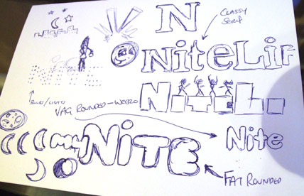
As always, the first stage of the process was to scribble down some ideas and drafts. The original ideas sketched out included the use of spotlights, rounded typefaces, dancing silhouettes, moon shapes and classy serif typfaces.
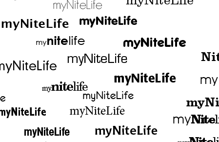
I then booted up Adobe Illustrator to test out a range of type treatments, ranging from thin and modern sans-serif to sexy and classy serifs.
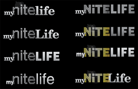
The next stage was to develop various choices of type into draft logo concepts, basing some ideas on the initial thoughts doodled out in the sketches. Planning ahead to the website I knew that a fairly dark colour scheme would be used, therefore I developed the logos on a black background to make sure they looked their best.
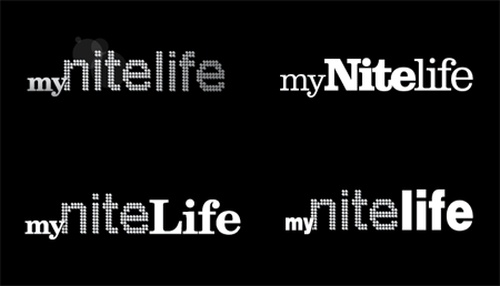
Continuous ideas and concepts developed the logo into four possible concepts, these were then sent to a few friends for their thoughts.
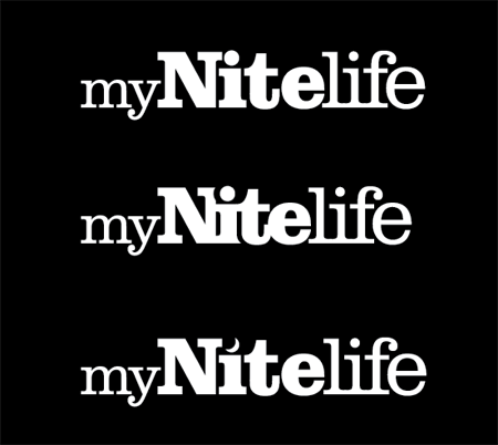
The chosen version was the entirely slab-serif based logo, this was then concentrated on and tweaked slightly into two new versions. The first tweak was to test out the logo with tighter kerning making the letters butt into each other and the second was to swap the dot on the letter ‘I’ for a crescent moon to represent the night time element.
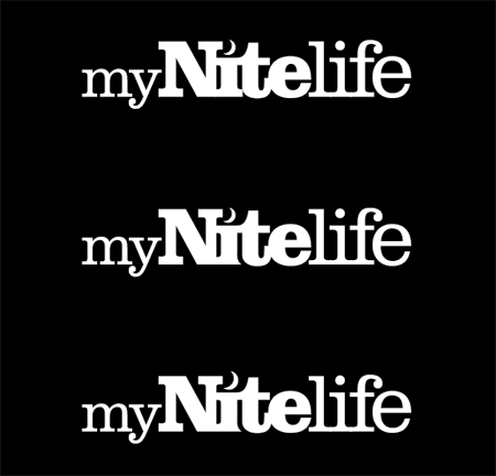
The tight kerning gave the logo a more modern and attractive appearance but made the letter ‘I’ interfere with the capital ‘N’. Combining this with the use of the crescent moon was a perfect solution.
One other issue was the slight interference with the letter ‘I’ and the letter ‘t’, experiments were made to knock out part of the letter with a flowing curve following the line of the ‘t’. This helps solve the problem and adds a little designerish touch!
The complete logo design was then complete, shown in it’s barebones mono state before being treated to colour and subtle effects.
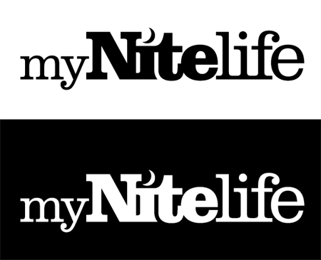
The Making of the myNiteLife Logo
Now you’ve seen my personal development thoughts behind the logo, I thought it would be great to show the techniques used in Adobe Illustrator to create the final logo from scratch.
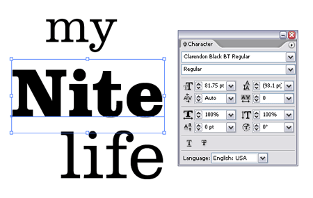
First off, the wording ‘my’, ‘nite’ and ‘life’ were typed out and set in the chosen font of Clarendon, making use of both light and black variations.
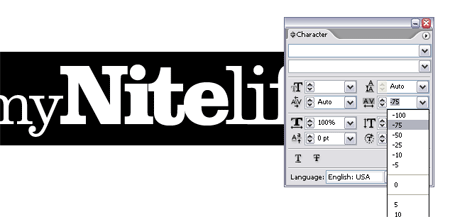
The tight kerning was quickly applied by choosing the -75 option from within the character palette.
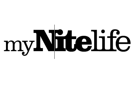
Additional kerning adjustments were made to individual letters, ensuring that all characters overlapped slightly. This was done by using the ALT key along with the left and right cursor keys.
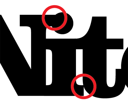
As mentioned previously, this causes unwanted interference with some characters, the solutions of which were to add the pretty curve along the letter ‘I’ and swap the dot for a crescent moon.
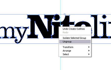
The line of type was converted to outlines (Type > Create Outlines) to make each letter an editable shape. These were then ungrouped to enable access to the letters individually.
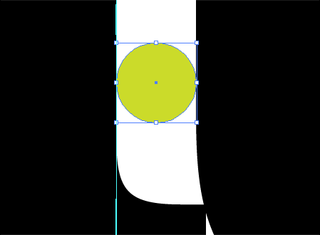
A temporary circle was used as a tool to measure the gap between the letters ‘I’ and ‘t’.
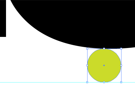
The same tool was used to plot a guide at the same distance from the bottom of the letter ‘t’.
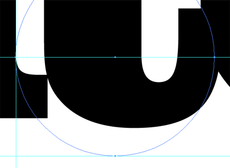
A third guide was added to the lowest most part of the straight edge of the letter ‘I’. Using all three guides a larger circle was drawn which resulted in an accurate curve that followed parallel to the outline of the letter ‘t’.
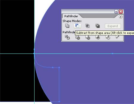
Using this new circle along with the Subtract from Shape Area option from the Pathfinder tool enabled the excess section of the letter ‘I’ to be chopped out.
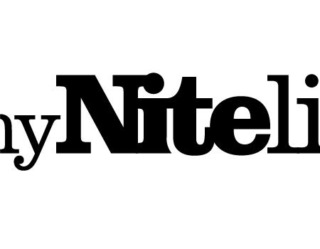
The resulting shape of the letter ‘I’ I think gives a slightly more unique characteristic to the logo.
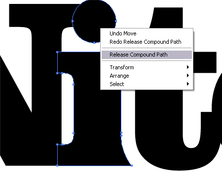
The final fix to the logo was to add the crescent moon shape to relate to the night aspect of the brand. To edit the letter ‘I’ the Compound Path was released to separate the shape into two pieces.

The dot was scaled up to give more of a visual impression, then a temporary circle was used to knock out an area of the shape to give the crescent shape.
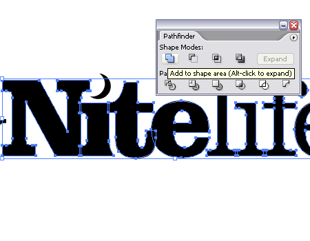
The only remaining step was to clean up the logo by combining all the individual letter shapes into one complete object using the Add to Shape Area from the Pathfinder tool.

With the logo being generated in the mono state it could then be given some sprucing up with colour and slight visual effects. The colour purple was chosen for the brand to relate to the sexy and classy image that the myNiteLife site was to portray, and also gives a nice deep colour to represent the colours associated with dusk.
