
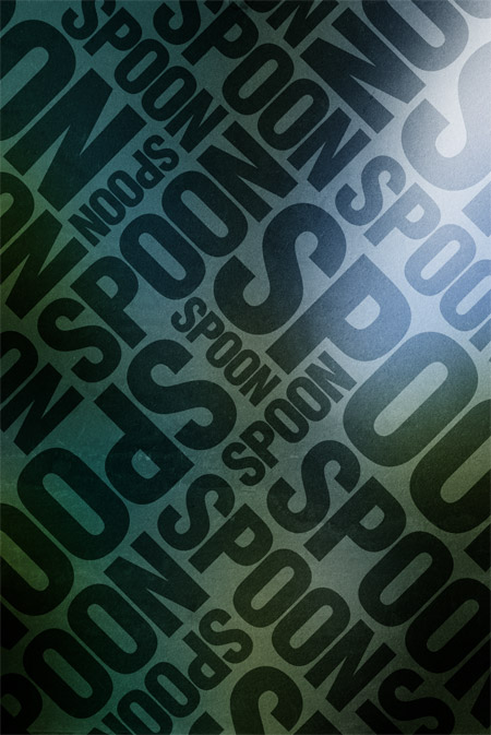
Using simple shapes can produce some great looking contemporary designs that fit well as impactful posters, a good example being the recent Trendy Geometric Lines tutorial. This time we’ll look at stripping back the tools to creating an interesting and eye-catching poster with a single typographic word.
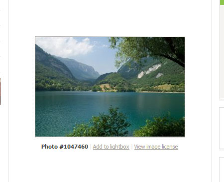
Find a random image to base the design on, the subject of the photo isn’t at all important, just choose a picture with varied contrast and preferably tailored towards your chosen colour scheme. In this case I’ve picked out a landscape scene with a mix of blues and greens.
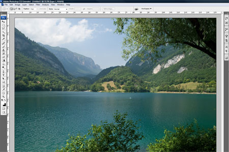
Open up the image in Adobe Photoshop and resize accordingly.
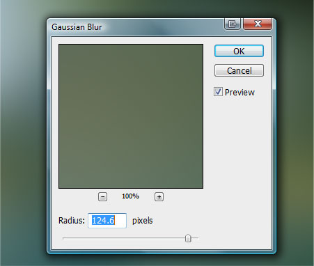
Go to Filter > Blur > Gaussian Blur, drag the slider almost all the way to the maximum to completely disguise the original subject and blend together the colours and tones.
Head over to the fantastic Bittbox.com and download one of the free high-res textures. Place the texture on a new layer in the Photoshop document.
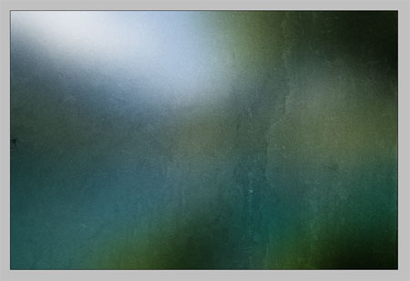
Desaturate the image then change the blending mode to Soft Light and drop the opacity to suit, adding a little detail and roughness to the image.
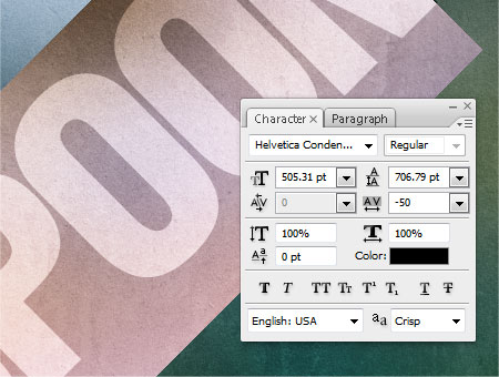
With the Type Tool, write out your desired wording. Of course, I have used the word SPOON and set in the bold and prominent Helvetica Condensed Black.
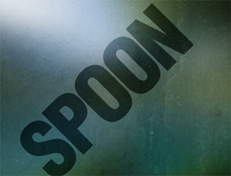
Rotate the block of text to 45 degrees (hold shift to constrain the angle). Set the blending mode to Soft Light to allow the underlying texture to show through.
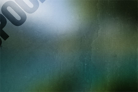
Position the text to encroach onto the document covering the top corner. Whilst holding ALT drag a copy of the text and scale into a new position.
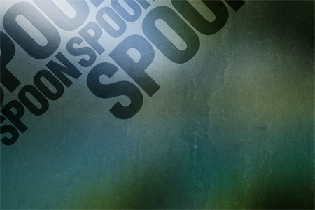
Hold the ALT key and drag two more copies of the text, resize them and position to fill out space on the document.
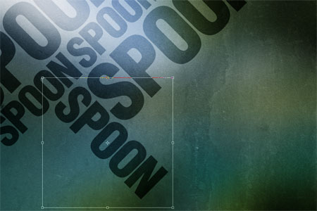
With the next copy, rotate the text by 90 degrees leaving it perpendicular to the other variations. Move the text into place leaving the same gap between the other text objects.
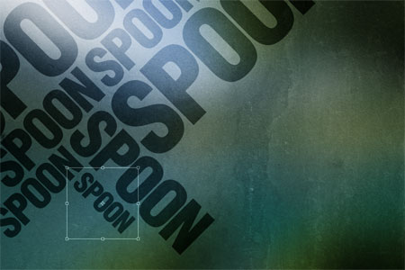
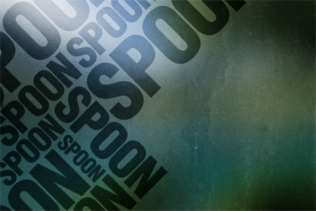
Create more instances of the text and rotate and scale into varying positions, ensure that each block aligns to the diagonal gridlines of the composition that are being formed.
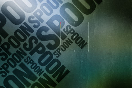
When gaps appear in the document, visualise how the word can be scaled or rotated to fill the gap whilst aligning to the gridline and leaving the same gap around the objects.
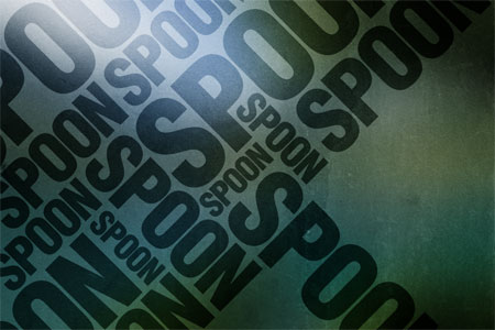
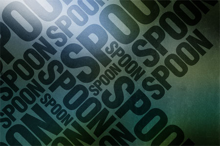
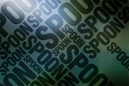
Also take into consideration the spread of large and small instances of the text to ensure that the sizes are varied without clusters of similar sized objects creating an unwanted focal point.
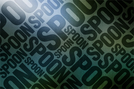
With multiple copies of the text being scaled and rotated into place the document is now completely filled.

Make any final tweaks to the poster such as altering the overall layout and making small edits to the individual objects, leaving a trendy poster design based almost solely on a typographic layout of a single word!
